Today, Chrysler is part of Stellantis N.V., a multinational automotive group formed in 2021 through the merger of Fiat Chrysler Automobiles (FCA) and Groupe PSA.
Over the decades, the Chrysler logo has enjoyed a rich history of evolutions and yet always returned to its company roots.
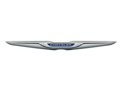
The latest edition of Chrysler’s winged logo sees a pair of elegant silver wings matched with a Chrysler inscription on deep blue background in the middle. Despite the elimination of the historic wax seal sign, the logo represents the company’s legacy through the trademark silver wings and looks sophisticated and modern thanks to its graceful shape and noble silver color.
According to creator Oliver Clark, the winged element of the logo serves dual purposes. Firstly, it serves as a reminder of the radiator on a car, symbolizing the automotive heritage of the brand. Additionally, by invoking the imagery of Mercury, the logo conveys a sense of dynamism, innovation, and the brand's dedication to pushing boundaries in the automotive industry.
Overall, by combining elements of tradition and modernity, the latest edition of Chrysler's winged logo effectively represents the brand's legacy while also conveying a sense of sophistication and contemporary style.
Chrysler Logo Timeline
01of 101924
PNG
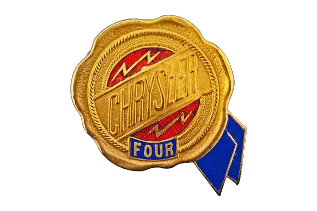
The first emblem used by Chrysler in the middle of the 1920s featured a golden wax seal enclosed within a golden circle. The emblem included a stylized blue and gold ribbon that extended just beyond the edge of the border.
The logo design was intricate, incorporating several elements. Inside the wax seal, there was a decorative rope-style pattern, adding a touch of elegance. Above the seal, a bar displayed the name "Chrysler" in capital letters, representing the brand. Surrounding the emblem were golden lightning bolts, symbolizing speed and dynamism, which added a sense of movement and energy to the design.
This emblem was chosen to represent the qualities of reliability, honesty, and quality associated with the Chrysler brand during that time.
02of 101928
PNG
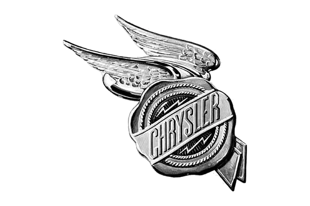
In 1928, the Chrysler logo featured a stylized winged emblem with a seal design. The wings on either side of the emblem were inspired by the wings of the Roman God Mercury, symbolizing speed and agility. The inclusion of wings conveyed the idea of movement and the dynamic nature of Chrysler vehicles.
The seal in the emblem represented the quality and dependability of Chrysler's products, underscoring the company's commitment to manufacturing reliable vehicles. The overall design aimed to communicate the attributes of speed, precision, and trustworthiness associated with the Chrysler brand.
03of 101930
PNG
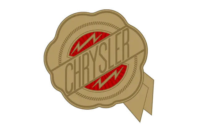
In 1930, Chrysler underwent a logo change where the previous winged emblem was replaced with a simpler design featuring a seal. This new seal design aimed to convey the attributes of luxury and quality associated with the Chrysler brand. The logo's color palette was updated to burgundy and gold, further enhancing the sense of elegance and premium craftsmanship.
This logo iteration in 1930 represented a significant shift in Chrysler's branding approach, emphasizing their dedication to producing high-quality vehicles while exuding a sense of luxury.
04of 101936
PNG
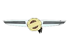
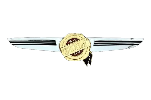
In 1936, the Chrysler logo underwent another change. The logo featured wings placed on both sides of the seal, designed with a sleeker and more streamlined appearance. The wings had a silver color with black horizontal stripes.
This logo iteration with the wings and the silver color scheme represented a shift towards a more modern and aerodynamic aesthetic, reflecting the design trends of the time. The black horizontal stripes added visual interest and enhanced the dynamic look of the logo.
05of 101955
PNG
In 1955, Chrysler introduced a new emblem that featured a sharp V-shaped wings symbol. This emblem was designed to represent the Hemi V8 engine, which was a significant innovation by Chrysler at the time.
The Hemi V8 engine, known for its hemispherical combustion chambers, was a high-performance engine that became iconic for Chrysler. The sharp V-shaped wings symbol in the logo was intended to visually capture the power and performance associated with the Hemi V8 engine.
06of 101962
PNG
In 1962, Chrysler introduced the iconic blue Pentastar logo, which became a significant emblem for the brand.
The Pentastar logo consisted of five solid triangles arranged to form a white five-pointed star, surrounded by thin and sharp rays in the center. The triangles represented the five divisions of Chrysler at the time: Plymouth, Dodge, DeSoto, Chrysler, and Imperial. This emblem symbolized unity and strength within the Chrysler Corporation.
The Pentastar logo was accompanied by uppercase black lettering placed below it. The lettering was executed in a heavy geometric sans-serif typeface, featuring bold and massive characters. This typography added to the logo's strong and impactful appearance.
The introduction of the Pentastar logo in 1962 marked a significant moment in Chrysler's branding history, and it became an enduring symbol of the company's identity for many years.
07of 101993
PNG
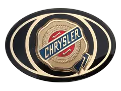
In 1993, Chrysler made the decision to pay homage to its roots and reintroduced a modified version of its original seal logo. The modified logo brought back the sleek and elegant seal design, resembling a wax seal, but with slight modifications to the color palette.
One of the modifications involved the color of the nameplate's ribbon. The ribbon, which previously had a different color, was now colored blue. This change added a touch of freshness and modernity to the logo while still maintaining its classic and recognizable design.
The return of the original seal logo in 1993 was a tribute to the brand's heritage and a way to connect with its rich history.
08of 101998
PNG
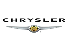
In 1998, Chrysler introduced a new logo design that featured a wax seal placed in the center of a set of silver wings. The wings had three "feathers" on each side, creating a symmetrical and dynamic appearance. The wax seal symbolized the company's heritage and reliability, while the wings added a sense of power and progress.
Above the image, a modernized version of the Chrysler wordmark was placed. The wordmark was presented in solid black, providing a sleek and sophisticated look. This logo design was a transitional phase that eventually led to the development of the current Chrysler logo we know today.
09of 102008
PNG
In the late 2000s, Chrysler began using the Pentastar emblem as a prominent visual element in its branding. The Pentastar emblem was commonly placed on the left side of the Chrysler wordmark, serving as a symbol of the brand's identity and creating brand recognition.
Along with the placement of the Pentastar emblem, the wordmark itself underwent a change during this time. It was updated with a more traditional typeface that featured bolder lines. This modification aimed to give the logo a timeless and classic appearance, reflecting Chrysler's heritage and emphasizing its brand values.
10of 102009
PNG
In 2009, Chrysler introduced a new logo design that represented a chic and elegant interpretation of its winged emblems. The logo underwent significant changes, departing from the previous seal design and adopting a more streamlined and modern approach.
Instead of the seal, a blue line became the central element of the logo. The blue line featured the Chrysler wordmark placed on it, creating a sleek and minimalist look. The three-dimensional wings also underwent modifications, with smoother and fuller lines, giving them a balanced and sophisticated appearance.
The blue and silver color palettes used in the Chrysler logo during this period represented professionalism, longevity, and stability, aligning with the brand's positioning and values.
Throughout its history, Chrysler has undergone changes in its logo design, evolving to reflect the company's growth, vision, and branding strategies. The original golden wax seal emblem, with its intricate details and symbolism, played a significant role in establishing the identity of the brand in its early years.
 Volkswagen
 Toyota
 Stellantis
 Mercedes-Benz Group
 Ford Motor
 Michelin
 Bridgestone
 Continental
 Goodyear
 Sumitomo