In the process of coming up with a new name for his company, August Horch held a meeting with his business friends, Paul and Franz Fikentscher. During the meeting, Franz's son, who was quietly studying Latin in the corner of the room, suggested the name "Audi" as an alternative to "Horch" (the "Horch" means "listen" in German, and "Audi" has a similar meaning in Latin). The suggestion was inspired by the Latin phrase "audiatur et altera pars..." which translates to "let the other side be heard" or "listen to the other side."
The similarity in meaning between the two languages made "Audi" an appropriate and meaningful choice for the company's name. So, the idea of using "Audi" as the company name was enthusiastically accepted, and on 25 April 1910, the company was officially registered as Audi Automobilwerke GmbH Zwickau (later known as Audiwerke AG Zwickau).
Audi's four-ring logo represents an important period in the company's history. Here's the story behind it:
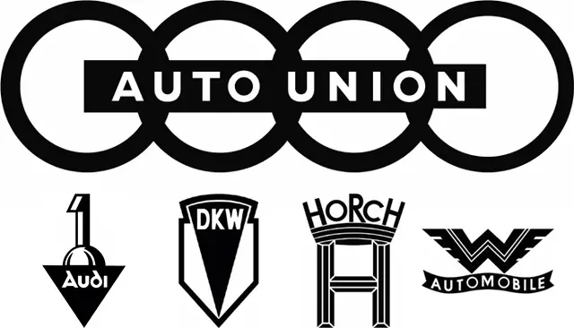
On 29 June 1932, Audiwerke, Horchwerke, and Zschopauer Motorenwerke J. S. Rasmussen AG (DKW) merged to form Auto Union AG. This merger was initiated by the State Bank of Saxony. Simultaneously, a purchase and leasing agreement was made with Wanderer for the acquisition of its motor vehicle division. The headquarters of the newly formed company, Auto Union AG, were located in Chemnitz, Germany.
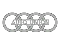
To symbolize the unity and collaboration among these four companies, a new logo was designed. The logo consisted of four interlinked rings, each representing one of the merging manufacturers. The four rings were meant to showcase the strength and solidarity of the newly formed Auto Union. Following the merger, Auto Union AG became the second-largest motor vehicle manufacturer in Germany.
Within the Auto Union AG group, each brand was assigned a specific market segment: DKW focused on motorcycles and small cars, Wanderer produced midsize cars, Audi operated in the deluxe midsize segment, and Horch manufactured luxury cars at the top end of the market.
Today, the four-ring logo has become an iconic emblem associated with Audi's values and achievements.
Audi Logo Timeline
1of 121909 (Pre-Launch)
PNG
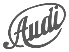
Audi's first logo, introduced in 1909 as a pre-launch version, featured a stylized cursive inscription. The use of a dark gray color palette conveyed a professional and no-nonsense aesthetic to the logo design. It's important to note that this design featuring the stylized cursive inscription and the dark gray color palette was only used for a few months during the pre-founding phase of August Horch Automobilwerke GmbH in 1909.
2of 121909
PNG
After the initial pre-launch logo design featuring a stylized cursive inscription, there were no significant logo changes made by Audi in the same year.
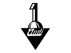
The first badge, featuring a voluminous number "1" emerging from a sphere and a black triangle pointing downward, has a more abstract and modern aesthetic compared to the original logo. The use of white cursive lettering on a black background adds an element of elegance and sophistication to the design.
This combination of abstract shapes and contrasting colors can create a visually striking logo that captures attention and conveys a sense of modernity.
3of 121910
PNG
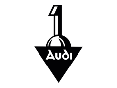
The following year, the emblem was updated in the following year with some details, and the white cursive wordmark was changed to a more easily recognizable font. These updates enhanced the logo's visual appeal and legibility. The fact that the emblem remained with Audi until 1932 when the Auto Union was formed further highlights the importance of the brand's history and evolution.
4of 121932
PNG
In 1932, the four companies, namely Audi, DKW, Horch, and Wanderer Automobile, merged to form Auto Union AG. This merger was prompted by the economic crisis of the time, which had a significant impact on the automotive industry.
With the formation of Auto Union, a new logo was introduced to represent the unified entity. This logo featured four rings, each representing one of the four brands (Audi, DKW, Horch, and Wanderer), connected together. The logo symbolized the unity of these companies and the collective strength of the union.
The four-ring logo has since become an iconic emblem associated with Audi, representing not only the brand's history but also the combined legacy and expertise of the four companies that formed Auto Union.
5of 121949
PNG
In 1949, a simplified version of the Audi logo was introduced. In this version, the individual brand emblems within the circles of the four-ring logo were removed. Instead, a horizontal rectangle was added, featuring the words "Auto Union" in a simple sans-serif font.
This modification reduced the complexity of the emblem by removing the separate logos within the rings, resulting in a cleaner and more streamlined design.
6of 121969 (NSU)
PNG
In 1965, Audi Union came under the control of Volkswagen, which marked a new era in the company's development.
In 1969, the merger of Auto Union and NSU Motorenwerke AG resulted in the formation of Audi NSU Auto Union AG, which later became Audi AG. The inclusion of "NSU" in the logo during that period reflected the consolidation of the two companies and their shared history.
7of 121969
PNG
Later in the same year, Audi introduced an alternative version of the logo that removed the rectangular banner, retaining only the four rings. This alternative version simplified the design further, emphasizing the iconic interlinked rings as the main element of the logo.
The rings were in a blue color, representing the Audi brand. Notably, the company name was absent from the logo, emphasizing the recognition of the four rings as a standalone symbol of Audi.
8of 121969
PNG
During this time, another distinct logo was developed, featuring a horizontal black oval shape. Inside this geometric shape, the Audi lettering was incorporated. The inscription was created in a unique manner, featuring a non-standard font with bold white letters. Notably, the letter "d" in "Audi" had a rounded design, which became a distinguishing feature of the logo.
9of 121978
PNG
In 1978, the Audi logo underwent a change where the oval background turned red and was outlined with a white border and a thin red border. This design choice aimed to enhance the contrast and make the emblem more distinct and visually striking. The use of red for the background and the white and red outline indeed added vibrancy and visibility to the logo, making it stand out more prominently.
10of 121995
PNG
In 1995, Audi introduced a new logo design where the separate emblems of the rings and the wordmark were merged into a single cohesive symbol. The logo featured silver three-dimensional rings, which gave a sense of depth and sophistication. Underneath the rings, there was a bold red lettering of the word "Audi" in a custom typeface.
The design of the logo struck a balance between the thin and delicate contours of the rings and the bold and massive wordmark. This combination created a visually appealing contrast and added an element of elegance and exclusiveness to the overall image. The silver rings represented the brand's history and legacy, while the bold red lettering added a touch of modernity and dynamism.
11of 122009
PNG
The renewal of the Audi logo in 2009 to commemorate the brand's 100th anniversary brought several significant changes. The increased size of the ring and the use of a bright and smooth chrome finish made the logo more prominent and visually striking. This modification aimed to create a stronger visual impact, symbolizing technological progress and modern style.
Simultaneously, the nameplate or lettering was reduced in size and repositioned to the lower left of the logo, allowing the ring to take center stage and become the focal point of the design. The font used for the lettering also underwent a change, transitioning to a more traditional sans serif typeface. This new typeface added a sense of elegance and sophistication to the logo, aligning with Audi's reputation as a premium car brand.
12of 122016-Present
PNG
In 2016, Audi's logo underwent a significant simplification. The previous 3D elements were removed, resulting in a more streamlined and minimalist design. The iconic interlinked four rings also underwent a color change. Instead of being silver, they became black. The updated logo no longer features any additional inscriptions, contributing to a more stylish and concise appearance.
Audi officials described the new logo using the principles of purity, reduction, and consistency. The intention was to create a logo that remains recognizable and consistent across various mediums, such as magazines, mobile devices, and billboards, providing a unified brand experience for users. This shift aligned with the industry's broader trend of flat design and reflected Audi's pursuit of a more minimalistic and refined visual aesthetic.
 Volkswagen
 Toyota
 Stellantis
 Mercedes-Benz Group
 Ford Motor
 Michelin
 Bridgestone
 Continental
 Goodyear
 Sumitomo






 When the Auto Union was formed, the four rings appeared as a symbol for the first time.