| Rank | Company | Country |
|---|---|---|
| #1 | Germany | |
| #2 | Japan | |
| #3 | Netherlands | |
| #4 | Germany | |
| #5 | United States |
| Rank | Company | Country |
|---|---|---|
| #1 | France | |
| #2 | Japan | |
| #3 | Germany | |
| #4 | United States | |
| #5 | Japan |
The blue and white colors of the BMW logo are taken from the Bavarian flag colors, symbolizing a tribute to the company's origin in Bavaria, Germany.
The full name of BMW is Bayerische Motoren Werke, which translates to Bavarian Motor Works in English. As the above would indicate, the name reflects the company's origin in the German state of Bavaria, and the initials of the German name happen to be the same in English.
Today, the name BMW is widely recognized and celebrated around the world and has become synonymous with luxury, high-quality, high-performance vehicles.
The BMW logo was first introduced in 1917, and it has undergone several changes over the years. However, the blue and white colors have remained a constant feature of the logo.
For many years, there was a popular myth that the blue and white colors of the BMW logo were meant to represent a spinning propeller, in honor of the company's origins as an aircraft engine manufacturer. However, this is not entirely accurate.
For BMW, the blue and white colors of the BMW logo symbolized the Bavarian flag colors and represented the company’s origin in Bavaria, Germany.
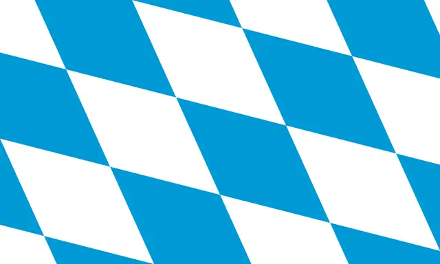 Flag of Bavaria (lozengy)There are officially two flags of Bavaria: the striped type, and the lozenge type, both of which are white and blue.
It's worth noting that the quarters of the inner circle on the BMW logo display the state colors of the State of Bavaria – white and blue. But they are in the inverse order (at least as far as heraldic rules are concerned, where you read clockwise from the top left).
The reason for this inverse order of blue and white in the BMW logo was the local trademark law at the time, which forbade the use of state coats of arms or other symbols of sovereignty on commercial logos.
RELATED: Top 6 Fastest BMW Cars of All Time
The BMW logo, also known as the "BMW roundel," has its origins in the logo used for the Rapp Motorenwerke company, which was an aircraft manufacturer that eventually evolved into Bayerische Motoren Werke AG (BMW) as we know it today.
The original Rapp Motorenwerke logo consisted of a circle with a black horse figure inside, with the words "RAPP and Motor" curved along the top and bottom portions of the circle.
What does the horse symbolize in a logo?
At the time, horses were still commonly used for transportation and were seen as a symbol of speed and power. To represent these qualities in their engines, Rapp Motorenwerke used a black horse on their logo.
The first version of the BMW logo was based on the logo of Rapp Motorenwerke. However, the image of a horse disappeared, and in its place appeared stylized airplane propellers in the colors of Bavaria's flag.
The first BMW logo featured a roundel with a black outer circle, two thin gold outlines, and the letters "BMW" in the center. The roundel was a nod to the company's aviation roots, as it resembled an aircraft propeller. The blue and white colors of the logo were taken from the flag of Bavaria, the German state where BMW is headquartered.
Since then, the BMW logo has undergone several more modifications, but the basic design elements have remained the same. The blue and white quarters, the black circle, and the letters "BMW" continue to be the core components of the logo, and they have come to represent the brand's values of quality, innovation, and excellence.
In 1933, the logo was modified and modernized.
The outer circle of the logo was made thicker, and the gold outline was enlarged, giving the logo a bolder appearance. The most significant change to the logo was the typeface used for the letters "BMW."
The new typeface was a sleeker, more modern design with smooth, bold serif lines. This gave the logo a more sophisticated and elegant look.
In 1953, the gold color in the BMW logo was replaced by silver, giving the logo a more modern and sleek appearance. The blue and white pattern was also modified to be lighter, which gave the logo a fresh and clean look. The black outline was made thinner and more delicate, and a thin silver outline was added to give the logo more depth and dimension.
The font used for the letters "BMW" was also changed to a sharp, straight serif font with distinct cuts and edges, reflecting the brand's powerful and progressive image.
The BMW logo underwent a redesign in 1963. The contours of the badge became sharper, and the serif letters were replaced with a sans-serif type in a bold white font. The colors in the central circle changed again, this time to a darker blue.
The redesign considered contrasting color effects of black, blue, and white, with the circular frames and the wordmark "BMW" becoming white on a black circular ring. This logo design was clean, attractive, and spoke of authority and loyalty.
In addition to the changes in the logo design, the lettering of "BMW" was changed to Helvetica Extended Bold, which formed the basis of the current version of the logo.
The 1997 BMW logo features a more three-dimensional circle with a thick black frame in a silver-gray outline and white sans-serif nameplate. The blue and white patterns inside the circle are separated by black lines, which give the logo a more modern and professional look.
This version logo is recognized as one of the most distinctive and iconic car logos in the automotive industry and has helped to establish the BMW brand as a symbol of quality, luxury, and performance.
Despite the update of the BMW logo in 2020, the version logo is still used on many BMW models, particularly on the bonnets and steering wheel of the cars.
The current 2020 BMW logo features a more modern and flatter look, with a transparent background that replaces the outer black ring. The font used for the letters "BMW" was also modified to be more minimalist, with just grey, blue, and white as central colors.
The new logo is intended to symbolize the importance and relevance of the BMW brand for mobility and the digital age. It is designed to be more flexible and adaptable for use in various digital media and platforms, while still retaining the classic elements of the BMW logo.
The new logo is gradually being introduced across the brand's marketing and promotional materials, but it may take some time before it is fully adopted on all BMW models.
RELATED: The 7 Best BMW Future Concept Cars
| Rank | Company | Country |
|---|---|---|
| #1 | Germany | |
| #2 | Japan | |
| #3 | Netherlands | |
| #4 | Germany | |
| #5 | United States |
| Rank | Company | Country |
|---|---|---|
| #1 | France | |
| #2 | Japan | |
| #3 | Germany | |
| #4 | United States | |
| #5 | Japan |