| Rank | Company | Country |
|---|---|---|
| #1 | Germany | |
| #2 | Japan | |
| #3 | Netherlands | |
| #4 | Germany | |
| #5 | United States |
| Rank | Company | Country |
|---|---|---|
| #1 | France | |
| #2 | Japan | |
| #3 | Germany | |
| #4 | United States | |
| #5 | Japan |
Are these plagiarisms or evidence that great minds think alike? You decide!
A logo is a simple but vital part of your business's identity. Get it right and you're set up for success. Get it wrong and people won't take you seriously.
There are a variety of car logos in the world, and each car company has a unique logo. However, some car brand logos look very similar.
Are these plagiarisms or evidence that great minds think alike? You decide!
Let's take a look! The following 20 car logos are very similar.
![]()
Mazda logo vs. Haima logo
The Mazda logo is a highly-styled “M” with its arms raised like wings, symbolizing the brand’s “flight toward the future.
Haima's logo represents a mythical bird flying away from a rising sun. In April 2009, Reuters reported that the company’s partnership with Mazda ended.
![]()
Both are oval shapes.
The Acura logo comprises of a stylized capital letter “A”, It is generally known as a symbol of quality, accuracy, perfection, and efficiency.
The Changan logo used " V" font, the implication for " victory " and " (success); value (" value);.
![]()
Similar shape (oval), and color schemes (several shades of red colors), the difference is that the company name is different.
![]()
Oldsmobile logo vs. Mahindra logo
Although the shapes are somewhat similar, the meaning is completely different.
Oldsmobile logo symbolizes the rocket piercing the oval shows the brand going outside the boundaries, and its asymmetrical shape reflects its originality.
Mahindra logo in its “M” identity represents three equal divisions pointing upwards resembling an apex on its tip. The 3 Mahindra divisions that were built by the company are products, services, and possibilities that are not symbolically included in other car logos.
![]()
Similar color schemes (blue, white and black), one is round and the other is oval.
![]()
Ford logo (old) vs. Karry logo
Similar shape (oval), and color schemes(several shades of blue and white colors), the difference is that the company name is different.
![]()
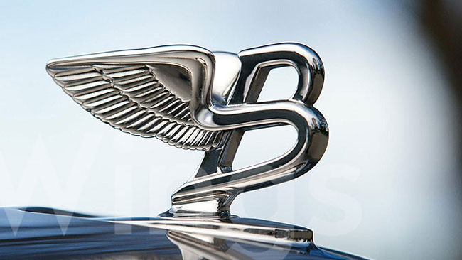
Bentley logo vs. JBA Motors logo
Similar 2 flying wings, in the middle of these 2 wings, an oval is placed which contains the company’s initials prominently.
RELATED: What do the Different Colors of the Bentley Logo Represent?
![]()
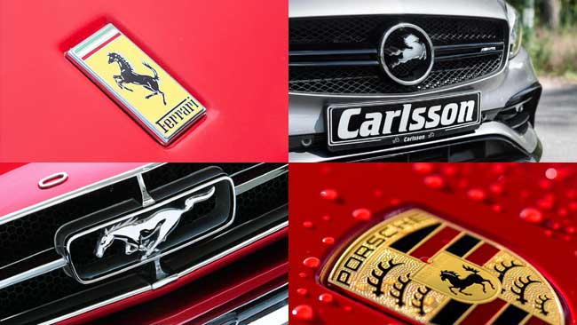
Similar shape and design schemes, both were created by Italians.
![]()
Rover logo vs. Roewe logo
Similar shield shape, and color schemes. Roewe vehicles were initially based on technology acquired from defunct British carmaker MG Rover. SAIC was unable to purchase the rights to the Rover brand name and created the Roewe marque as a replacement.
![]()
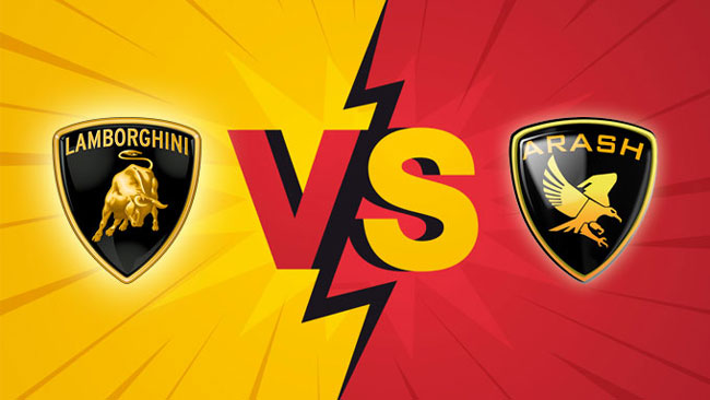
Lamborghini logo vs. Arash logo (old)
Similar shield shape, and color schemes, the difference is that one is a bull and the other is an eagle.
If you know more similar car logos, please share it with us.
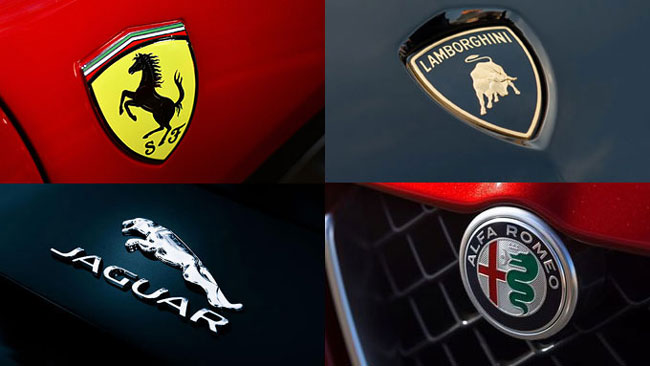
RELATED: Ferrari Logo vs. Porsche Logo, Why are they Similar?
| Rank | Company | Country |
|---|---|---|
| #1 | Germany | |
| #2 | Japan | |
| #3 | Netherlands | |
| #4 | Germany | |
| #5 | United States |
| Rank | Company | Country |
|---|---|---|
| #1 | France | |
| #2 | Japan | |
| #3 | Germany | |
| #4 | United States | |
| #5 | Japan |